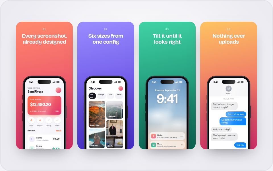
Put your screenshot in a device mockup, right in the browser
A raw screenshot says "work in progress". The same screenshot in a tilted device frame on a good backdrop says "launch". Flicka Mockups does that in the browser, from one drop.
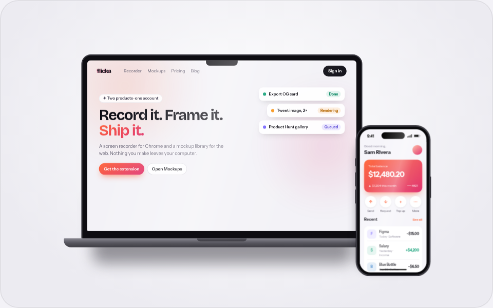
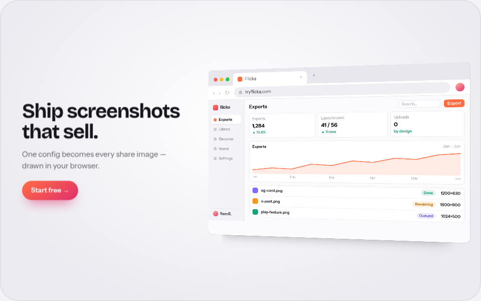
A raw screenshot reads like a work in progress: odd size, no context, your desktop peeking out at the edges. The same pixels inside a device frame, tilted a few degrees on a deliberate backdrop, read like a product. That framing used to mean a Figma template and half an hour; Flicka Mockups does it in the browser from one drop.
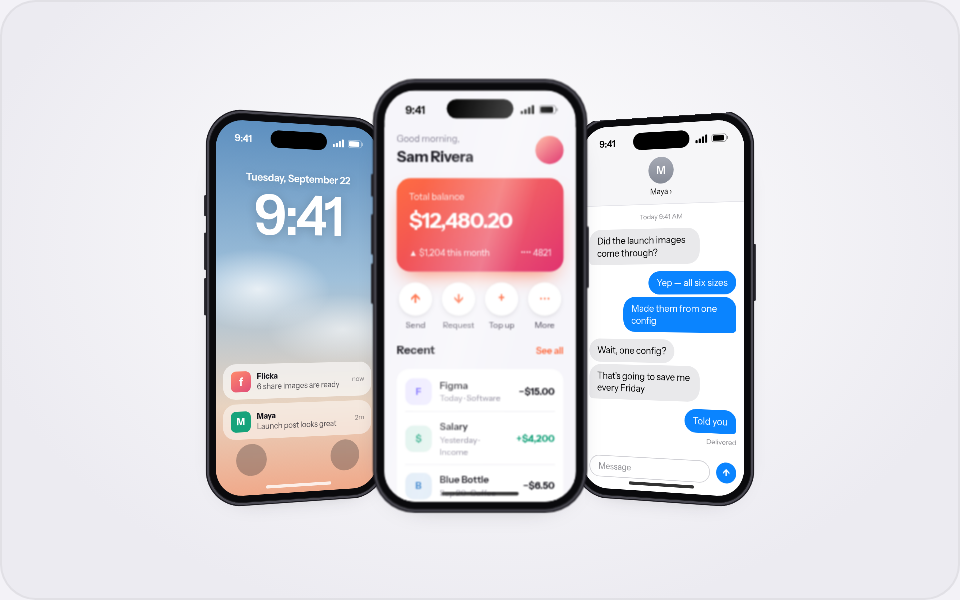
The library is 56 designed layouts — single devices, multi-device scenes, browser windows, App Store sets and social-proof cards. Every layout is live: drop one screenshot anywhere in the gallery and every tile wears it at once, so you choose a layout with your own product on screen instead of imagining it.
- MacBook frameThe wide screenshot goes here — a landing page or dashboard. Swap the frame for a browser window or an iPad from the editor's Devices panel.
- iPhone frameThe second slot takes a mobile screenshot. Each slot has its own image, fit and screen settings.
From screenshot to mockup in four steps
Open the library and drop your screenshot
Go to the library and drag any screenshot onto the page — or paste it. Every tile in the gallery previews it immediately.
Pick a layout
Single device, laptop + phone, a trio, a browser window with a headline — filter by how many screenshots you have and where the image is going.
Aim it on the canvas
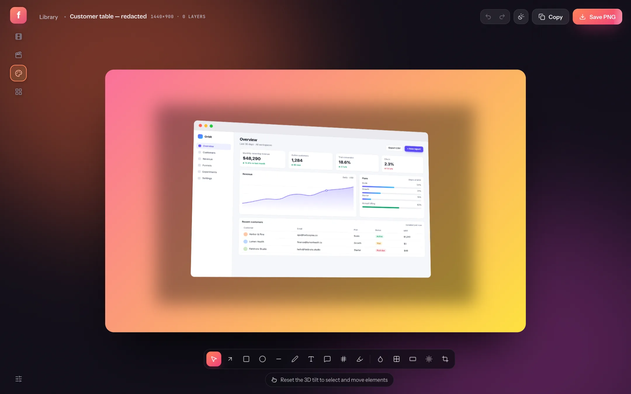
Tilt in 3D, choose a device finish, swap Chrome for Safari or Arc, set the backdrop — presets, custom gradients, shapes — and drag anything exactly where you want it.
Export a retina PNG
PNG, JPG or WebP at 1× to 4×, sized by canvas presets for OG images, X posts and the stores — or straight to the clipboard. Rendering is client-side; your screenshot never leaves the tab.
Pick the layout by the job
| You are shipping | Reach for | Why it works |
|---|---|---|
| A landing page hero | Window + text, Hero bleed-right | Real browser chrome plus a headline — the image explains itself. |
| A feature announcement | Laptop + phone, Tablet + phone | Two viewports say "responsive" without a word of copy. |
| A launch thread | Trio, Fan spread, Wave | Multi-device scenes carry a thread's first image. |
| App Store panels | iOS, iPad and Play sets | Numbered panels from one config — see the store-set guide. |
| Social proof | Testimonial, stat and thread cards | Quotes and numbers designed like product shots. |
Make it yours
- Custom URL and tab title — the browser frames default to your site, not a placeholder.
- Backdrops — 18 presets, solid colours, a gradient builder and background shapes (dots, grids, waves, rings).
- Shadows and glare — soft, hard, long or floating, and a screen glare that follows the tilt.
- Annotations — arrows, callouts, a zoom lens and text on top of the composition, like in the screenshot annotator.
Is Flicka Mockups free?
Sixteen layouts are free forever, including the single-device and browser frames. Pro unlocks all 56 — the multi-device scenes and the store sets — plus saved mockups.
Does my screenshot get uploaded?
No. The screenshot becomes a data URL in your tab, and composing and exporting run entirely in your browser. See what leaves your computer for the full accounting.
Which devices and formats are there?
iPhone, Pixel, iPad and MacBook frames, plus Chrome, Safari and Arc browser windows, in several finishes. Exports are PNG, JPG or WebP at up to 4×, straight to a file or the clipboard.